Teploenergo
Heat Investment Company

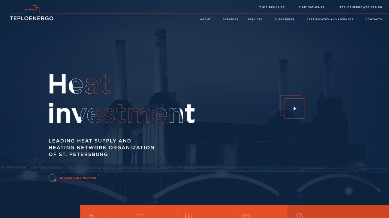
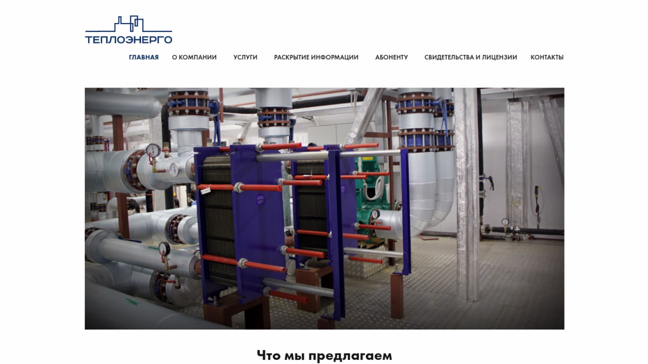
The old version of the website was very poor and had a bad structure. The header was in trouble and all of the design elements were outdated. We’ve animated life to the first screen.
 After
After
 Before
Except for usable information and data, we’ve decided to put a video background and some animated elements on the first screen. All those moments are about motion - cause the niche of the website is heat, and it should be alive!
The wish of the customer was to create an effective Landing page with the conversion rate emphasis. Also, a very important moment is about the visual graphics - it helps to create the right images in the mind of users.

Corporate style
The whole website was done using the corporate colors of the company - blue, orange and white. Also, as a requirement from the customer was usage of rather strict style to demonstrate the company from the respectable side.- Mobile
- Mobile
- Mobile
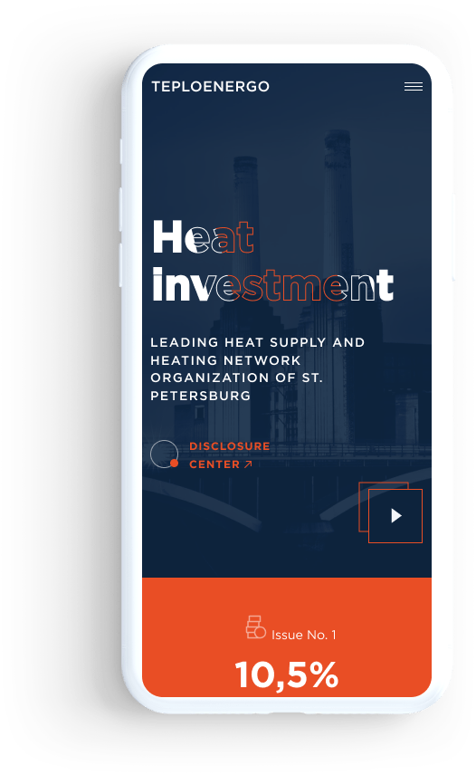
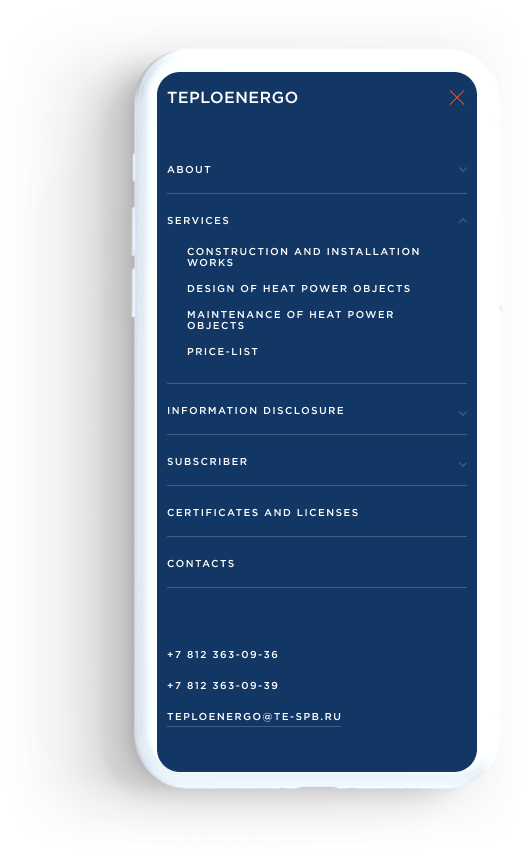
Mobile version
The main goal of the mobile version is to show the whole information in a way that is comfortable for the users. The website has a two-level main menu, so all those moments were taken into account during creation of the layouts.


